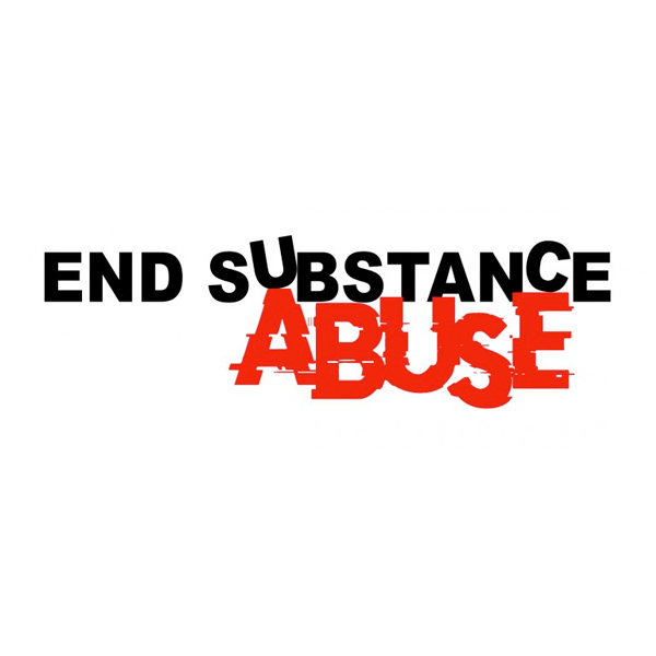
The Process Creating the new poster design began with the search for the correct message. It was clear SAMHSA desired to convince teens to not do drugs, but what was missing? I began doing research about the most impactful message and I landed on End Substance Abuse. I chose to create a typography where the A and E literaly pushed or dislocated the word substance. Hoping to subliminaly connect the idea that “Abuse” is the catalyst in the message.
The Resonating Colors Taking into account the gruesome and graphic nature of this subject I chose to use flag red and contrast with a b&w photo. This achieved the dark and possibly grotesque feeling I hoped to showcase in the design.
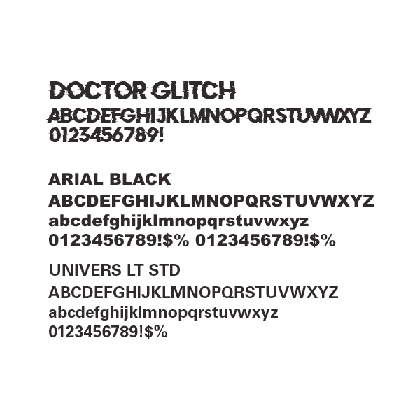
The Font Decisions Choosing the right fonts for this project was one of the more simple decisions. I chose to use Doctor Glitch because of the sharp lines and the disruption of the letters.
Arial Black also offers a strong visual, but with the combination of Doctor Glitch makes the headline easy to read at glance.
Univers LT was chosen for the body text to soften from the heavy line text, but still keeping strong lines to help communicate the harsh message at hand.